Readable text means confident delivery. Open the gear in the player to style the prompter.
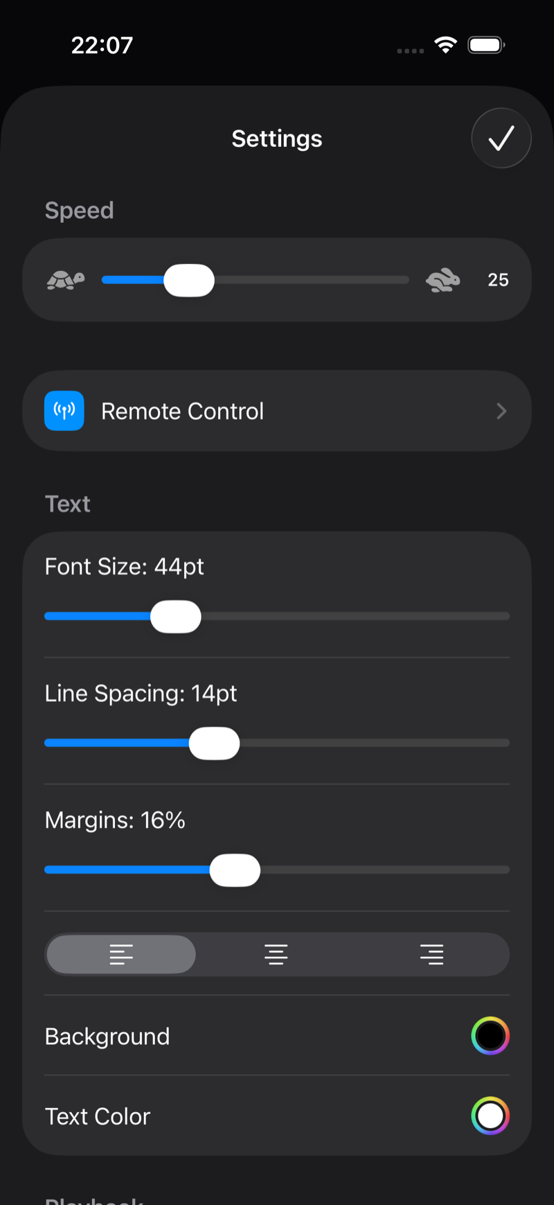
Text controls
- Font Size — from small notes to huge across-the-room text. Bigger sizes are easier to read far from the device; pair them with a slightly higher scroll speed.
- Line Spacing — extra air between lines reduces line-skipping when you glance away and back.
- Margins — narrower columns keep your eyes closer to the camera axis. Around 16% works well on a phone at arm's length.
- Alignment — left, centre or right. Left is easiest for long scripts; centre works for short punchy lines.
Colors
Background and Text Color are fully customizable. The default white-on-black maximizes contrast and minimizes screen glow on your face in dark rooms. Amber or yellow text on black is a classic broadcast alternative that is gentler on the eyes.
Text styling beyond the basics is a Pro feature; see Free vs Pro.